The psychology of colour in office design
These days, designing an office isn’t about much more than considering desk numbers and meeting room layouts. Good workspace design now considers how a space makes people feel and act. Colour plays a huge role in that, with the power to influence wellbeing, motivation and productivity. For companies competing to attract and retain talent, and for landlords wanting spaces tenants love, colour is far more than a decorative choice.
Why colour matters in the workspace
The average Brit will spend over 84,000 hours at work in their lifetime. With more companies issuing RTO mandates asking employees to return to the office, nobody wants to step back into a dull, uninspiring space. The look and feel of the workplace has a huge impact on how people think, feel and behave.
This is where colour psychology comes in – the study of how different colours affect mood, behaviour and even physiology. Research has shown that colours can calm aggression, stimulate creativity, reduce stress and even influence how people perceive a brand.
The concept isn’t new. In 1979, researcher Alexander Schauss discovered that painting prison walls pink reduced aggression among inmates. Nelson Mandela used the colour green in his political campaign to evoke hope and renewal. And over the years, businesses from Google to Airbnb have embraced colour psychology to create more engaging and productive workplaces.
What the research tells us
Colours aren’t just aesthetic choices, instead they trigger real physiological and psychological responses. According to Angela Wright, an expert on the unconscious effects of colour, scientifically, the first thing we register when assessing our surroundings is colour. It helps us recognize the difference and act instinctively toward joy, pleasure, threat, and danger. Studies show that:
- Red can raise heart rates and increase alertness
- Blue can boost focus and improve problem-solving ability
- Green reduces stress levels and promotes concentration
- Yellow sparks creativity and optimism
For office designers, these findings are practical tools for shaping environments where people and businesses can thrive.
Colour in action
Global giants like Google and Amazon reportedly tested different colours across their campuses to measure how employees responded – with some shades, like purple, found to have surprisingly negative effects. Closer to home, we often see how even small doses of colour can completely transform the feel of a workplace.
In fact, one study found that employees in well-designed, colour-optimised environments can experience up to a 15% increase in productivity compared to poorly designed spaces.
Colour can:
- Reinforce culture, whether that’s energetic, calm, creative or professional.
- Define zones and functions (e.g. different departments or activity types).
- Create a distinct brand identity within the workplace.
- Influence client perception the moment they step into reception.
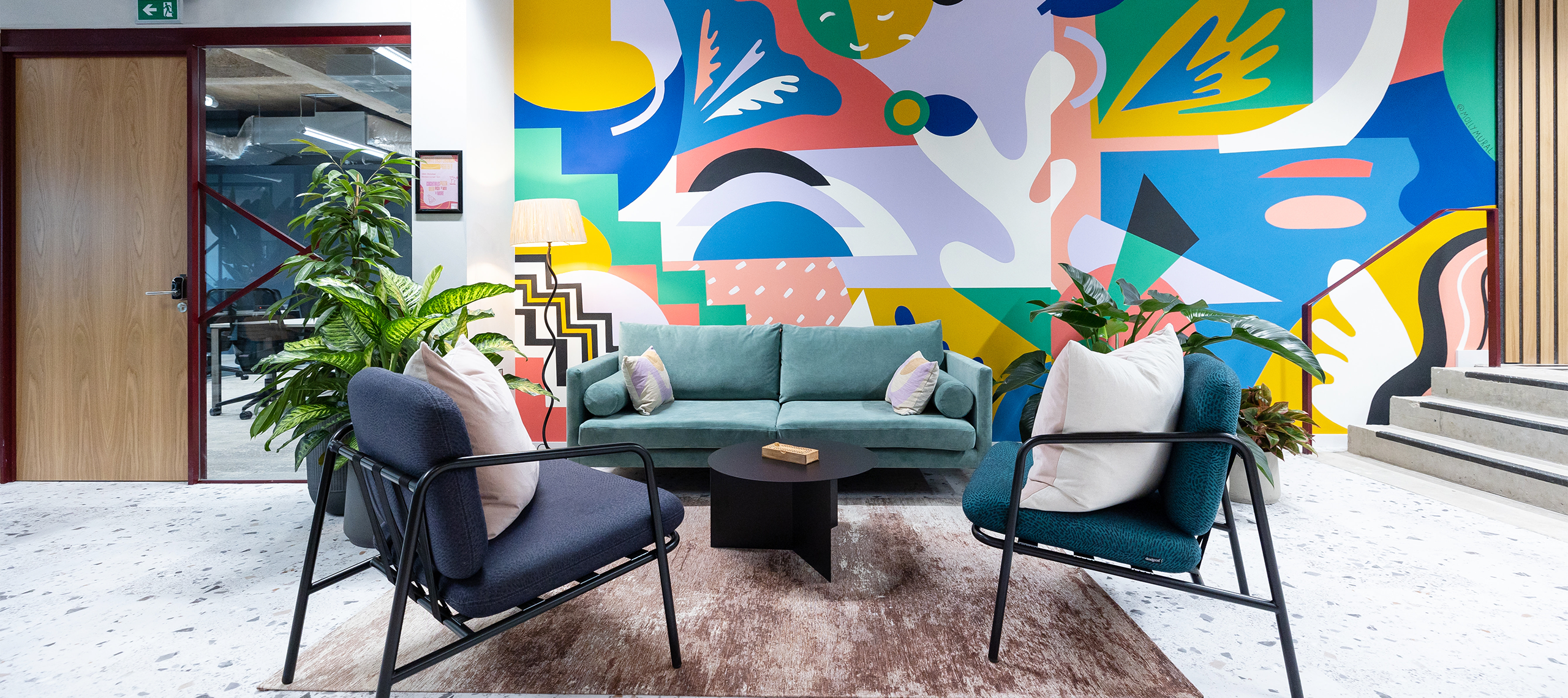
What different colours can mean for your workspace
The right palette depends on the behaviours you want to encourage in each area:
Blue – calm, focus, adaptability, productivity
Consistently ranked as one of the most popular workplace colours, blue comes out on top in Dr David Lewis’ study, naming it the all-round winner for enhancing mood and brain function. It is linked to improved mood and focus, and creates calm while keeping the mind stimulated – perfect for areas that need concentration or adaptability.
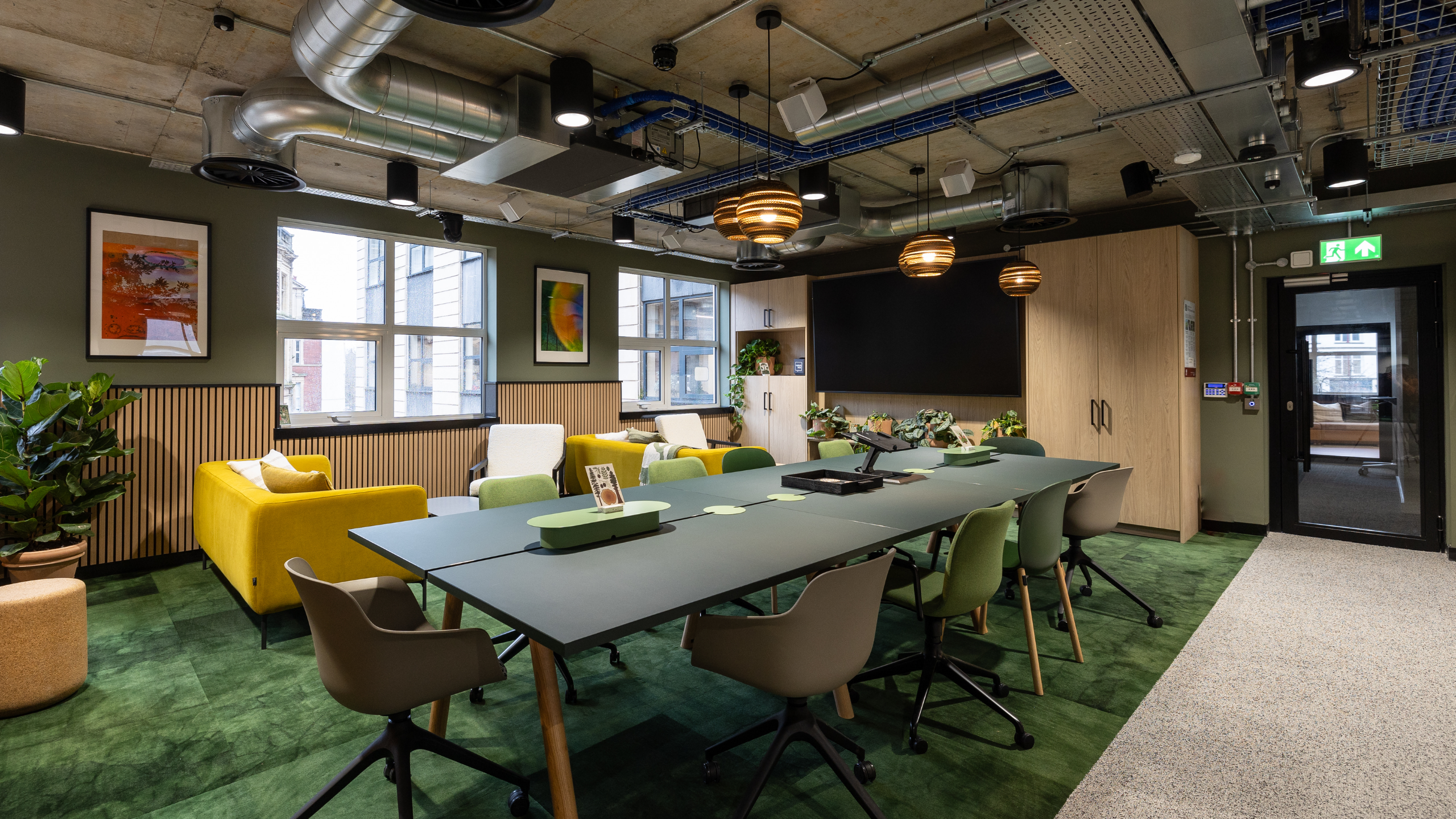
Yellow – optimism, creativity, collaboration
Yellow is often associated with energy and clarity. Entrepreneur Magazine suggests it stimulates creativity and enthusiasm. It works particularly well in brainstorming zones, collaborative areas or anywhere fresh ideas are encouraged.
Example: At Ultimate Finance, yellow accents injected new life into a financial services workspace, supporting a culture of optimism and innovation.
Red – energy, urgency, attention-grabbing
Red can increase energy and focus, but it needs careful handling. Used sparingly it can signal importance, urgency and dynamism – but in large amounts it can feel overwhelming.
White – balance, clarity, professionalism
White is often seen as neutral and clean, but in office settings it can also represent balance and optimism. Too much white, though, can feel clinical – which is why pairing it with warm materials is essential.
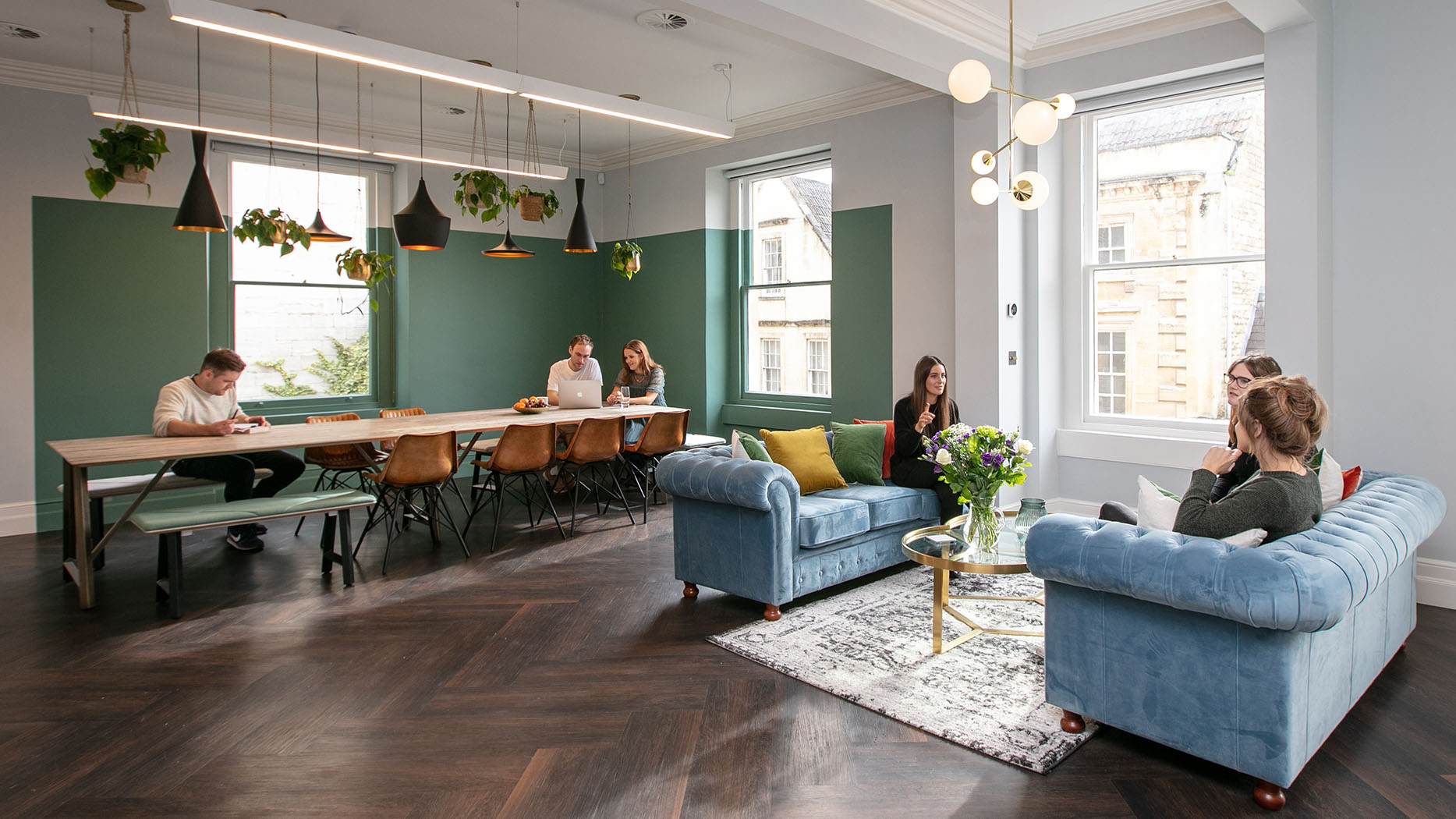
Green – reassurance, renewal, sustainability
Green is calming, reassuring and, unsurprisingly, linked to eco-credentials. It’s often used in breakout areas or meeting rooms, where stress needs reducing and focus matters. Different shades can set different moods – pale greens bring serenity, while dark greens suggest luxury.
Lavender – restorative, communicative, clear-thinking
Subtle lavender shades create a restful, almost therapeutic atmosphere. They work well in conference rooms, supporting communication and focus, though care is needed to avoid it feeling too pale or flat.
Using colour psychology in your workspace
It’s one thing to understand the theory – it’s another to put it into practice. Here are some straightforward ways colour psychology can be used to shape behaviour, support wellbeing, and strengthen culture in the workplace:
- Biophilic design – integrating natural greens through plants, finishes, and wall colours supports wellbeing and keeps the space feeling fresh.
- Use calming tones in focus areas – blues and greens can help reduce stress and improve concentration, making them ideal for quiet zones or individual workspaces.
- Add energising accents in collaborative spaces – splashes of red or orange, such as cushions or feature lights, in meeting rooms or breakout zones can boost creativity and encourage lively discussion.
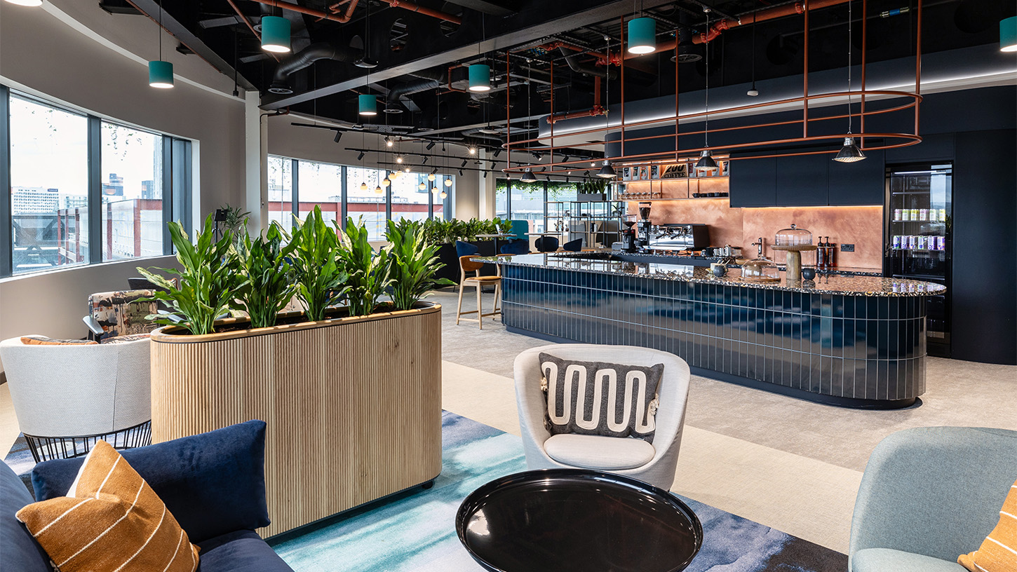
- Bring warmth to social spaces – soft earthy tones create a welcoming, homely feel in tea points, lounges, and reception areas.
- Reinforce your brand – subtle use of brand colours can build identity and belonging without overwhelming the space – whether that’s on soft furnishings, glass manifestations or even the coffee cups in your kitchen.
- Balance light and dark – clever contrasts can help with wayfinding and create distinct moods across different areas of the office. If an area of your office lacks natural light, consider painting it white or light neutral colours to make the space feel brighter.
Consider how you want your office to feel
Colour is one of the fastest ways to show what your company is about. The right palette can tell a story about your culture, your values, and the kind of experience you want people to have when they step inside.
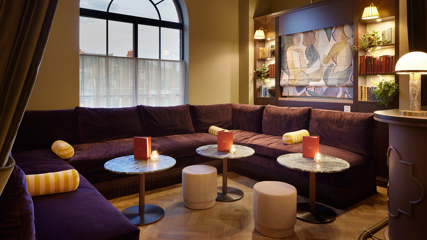
- Luxury and sophistication – deep, rich colours such as aubergine and dark green, paired with gold or brass accents, instantly signal prestige and exclusivity. Ideal for businesses that want to convey authority and heritage.
- Modern and innovative – crisp whites with bold accents create a clean, future-facing feel, often favoured by tech firms and ambitious scale-ups who want to showcase clarity, agility, and a forward-thinking culture.
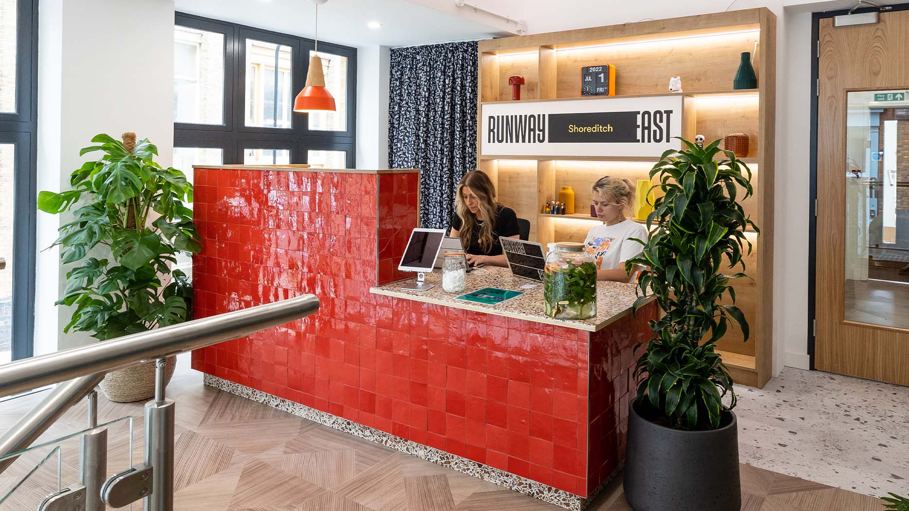
- Playful and community-focused – bold, bright colours convey personality, openness and energy. Coworking brands like Runway East lean on these palettes to express creativity and foster connection.
- Calm and restorative – muted pastels and natural tones send a message of care and balance, showing that wellbeing matters just as much as performance. Perfect for purpose-led businesses that want employees and visitors to feel instantly at ease.
Colour isn’t just decoration, it’s a tool for shaping behaviour, building culture and supporting wellbeing. Done right, it helps create offices people genuinely want to spend time in. Whether you’re a landlord repositioning your portfolio to attract higher-value tenants, or a business owner planning a refurb, colour psychology can be one of the simplest – and most cost-effective – ways to make your workspace more attractive, engaging and productive.
At Interaction we design and deliver workspaces that help people do their best work. Want to explore how colour could shape your next project? Get in touch today.
Join the Interaction community
Sign up for our newsletter to stay up-to-date with the latest insights
on the modern workplace and commercial property trends.


